Coronavirus: The data that moved the PM to change rules on gatherings
From Monday, gatherings will be limited to six people in England both outdoors and indoors.
Boris Johnson said it “broke his heart” to have to impose stricter measures, which have been driven by a rise in cases among those aged 20-29 and 30-39.
During a press conference at Downing Street, England’s chief medical officer Professor Chris Whitty presented the data which led to the change in rules.
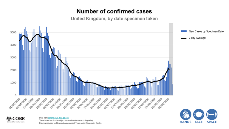
Graphs show the number of daily cases is rising, after falling for the last few months.
The seven-day rolling average is also beginning to move upwards across the UK.
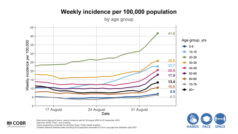
Prof Whitty explained that people aged between 20 and 29 are now the most infected group with a rate of 41.6 per 100,000. He said it was a “massive uptick”.
He added that it was good news that elderly people were now the least infected group, but was worried that younger people could easily spread the virus to their parents and grandparents.
In turn, this could trigger a rise in deaths, which so far has not happened.
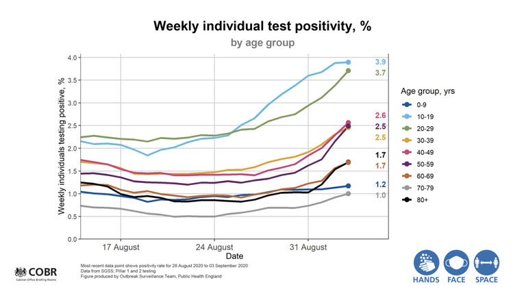
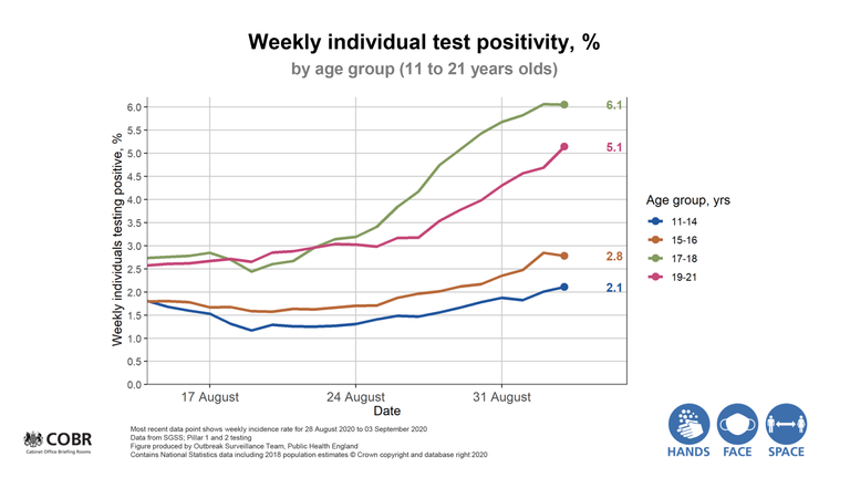
The chart above shows the percentage of people testing positive in age groups.
Again, it shows young people as having the highest rates of infection, with the elderly having the lowest.
Those aged between 19 and 21 have an infection rate of 54.5 per 100,000, followed by 17 and 18-year-olds with a rate of 48.1 per 100,000.
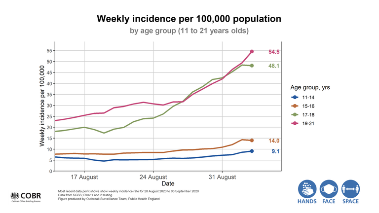
Those rates are well above the level that would prompt the government to make changes to its international quarantine list, which is 20 per 100,000.
Professor Whitty said the rates of infection among youths “have gone up really quite steeply since the middle of August”.
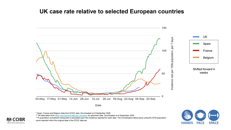
The UK’s infection rate is currently lower than in Spain and Belgium, however it is rising.
The chart above shows the infection rates model, shifted ahead by four weeks.
The UK’s infection rate is higher than France’s, which is seeing a surge in coronavirus cases.
Source: Read Full Article